

Reading a Dyno Graph
Before Reading this, please take a look at our ‘Dynos - What to know’ Blog - HERE
Many people think a dyno is a tool for measuring peak power and little else - while this is the figure over which many pub conversations are won or lost, the peak power itself is the least important and least relevant part of the graph. This article should help you understand more about dyno testing, what you can tell from a graph, and crucially, what a graph doesn’t tell you.
To the trained eye, a dyno graph contains a wealth of information. Studying the curves and reading some of the other numbers on the graph can reveal a huge amount about how the vehicle is likely to perform. Comparing two graphs side by side can tell you a lot about how one will feel to drive compared to the other, whether it will be a fast spooling and tractable torque monster, or if you’ll need to be in the right gear to accelerate hard. Tuners can often tell a little about how the testing has been performed - this can indicate how reliable the data is, and whether the graph is more or less comparable to another graph.
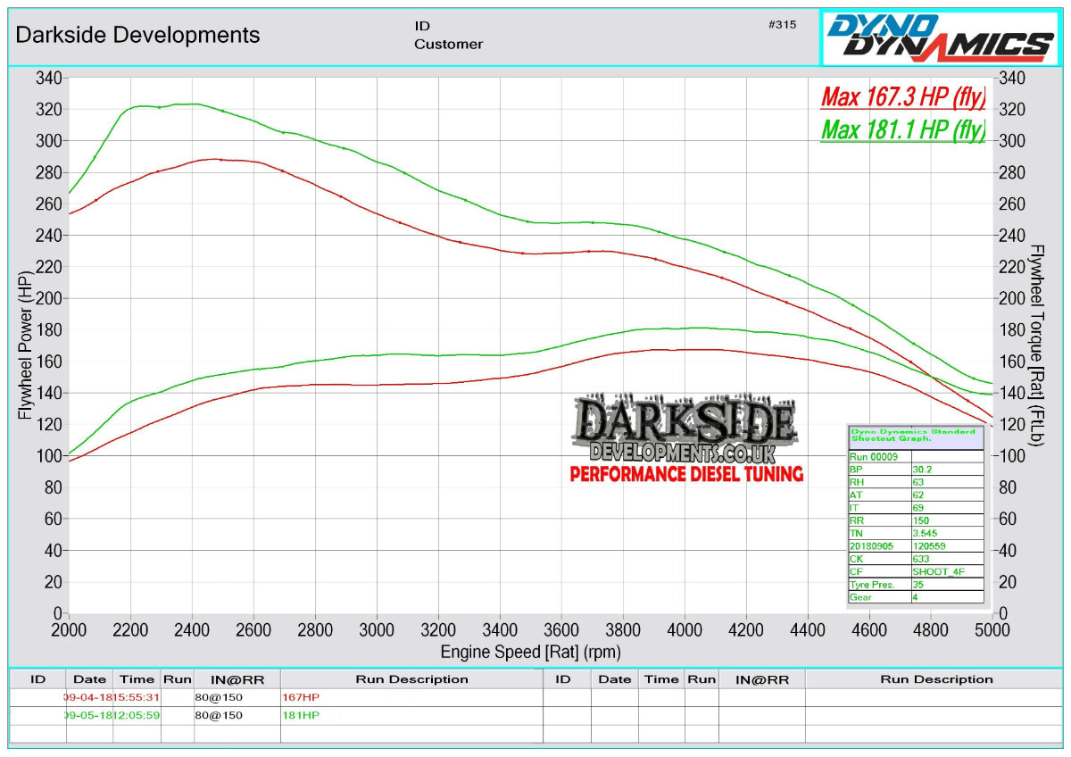
A typical dyno graph will show the power and torque of a vehicle through the full rev range at full throttle - if work has been carried out, often this will show a before and after graph, overlaid on the same sheet to make the differences clear, with a peak power and sometimes peak torque figure. The idea of this kind of test and graph is to demonstrate how the vehicle will perform when you accelerate through a gear.
These are the steps we take when looking at a dyno graph:
- Look at the shape of the torque curve - Generally the graph should be relatively smooth with no big bumps or dips. The graphs should not be wavy throughout. A wavy or bumpy graph usually means bad boost control or a just a bad tune. Be aware some dynos smooth the graph more than others.
- Look at the engine speed where peak torque and peak power occur - If peak torque occurs early and ramps up steeply, the turbo will likely be fast spooling and be responsive to drive. If the ramp up is softer the delivery will be smoother. If peak torque is later the car will likely have some lag, and require more revs and time for the turbo to produce full boost. If peak power is close to the rev limiter, the car will feel strong at the top of the rev range. If peak power is a long way before the rev limiter, the car will feel more strangled at the top end, and it is likely you will want to change up earlier.
- Look at the spread of torque and power - A wide torque and power band makes for a very drivable car with lots of usable performance. Looking at the region between peak torque and peak power - assuming the graph is fairly smooth, the further the distance in engine speed between peak torque and peak power the more drivable the car will be, with a large usable rev range and power band.
- Read the axes properly - Dyno graphs are formatted by the dyno operator, and differ between dyno brands. It is important to make sure you read the axis data to ensure you are reading the graph correctly. Ensure you aren't mixing up power and torque figures (very easily done) and pay attention to the Engine Speed axis - a good quick check is to see if the rev limiter in your car corresponds with the graph. If it is out by 100rpm or more the dyno graph will certainly display inaccurate figures.
- Do not assume the Peak Power figure is accurate - Even with the best will in the world, there are far too many variations to ever achieve a situation where tuning companies could produce accurate and comparable dyno graphs to one another. Comparing peak power figures between different cars, different dynos, different days and different operators really is total nonsense. People in the industry know this, but some choose to lead their customers astray when it suits them.
- Use your common sense - Despite the commonly held view amongst enthusiasts that a dyno graph is a sacred piece of infallible truth, it is a piece of data like any other, and subject to mistakes, error, and manipulation. It is how the tuner or customer interprets or uses the data which is important. If something looks wrong, it probably is. Any respectable tuner will be happy to answer questions about their dyno procedures.
In the UK and Europe it is conventional that dyno figures are displayed calculated at the flywheel, which is in line with how manufacturers quote engine power figures - so a ‘PD130' should make 130bhp at the flywheel.
In the United States figures quoted are usually at the wheels. There is no underlying reason for this - it is just how the industries in each country choose to do their marketing.
It is worth noting that a tuned power figure is almost worthless without a standard figure to compare to, for example, a PD130 with 190bhp using stock hardware is less impressive if it made 160bhp on the factory tune.
Another very important thing to understand is that a dyno graph is only a snapshot of vehicle performance. Knowing what a dyno graph doesn't tell you is also critical when comparing two hardware setups or software tweaks.
All a dyno graph is really showing is how the engine behaves at full throttle, at a certain ramp rate*, from a certain engine speed up to the limiter. Imagine for example a 2.0 turbocharged engine and a 5.0 naturally aspirated V8 - both may potentially have a very similar dyno graph. But if you were in 4th gear at 3000rpm, and then accelerated hard, both engines will respond very differently. The NA V8 will produce instant torque with a very sharp throttle response, whereas the 2.0 turbocharged engine will take time to build boost and deliver the performance.
Cars with terrible tunes can produce excellent dyno graphs, and then pile out smoke and drop into limp mode on the road. Some cars that drive very well can struggle to produce a good dyno graph because the specific dyno test causes boost control to behave in a way it never will on the road. It can be difficult to get a good dyno graph out of an Automatic or DSG transmission vehicle, and also some modern ECUs are problematic when they see that the front wheels are turning at 100mph and the rear wheels aren’t moving at all. Without knowing the full story, a graph can be meaningless, which is why it is only as useful as the tuner who is referring to it.
A little common sense and judgement goes a long way when it comes to dyno graphs. Dynos are a huge subject, and we will therefore be producing more articles to cover some other aspects of dyno processes, equipment, and how the data can be used. We hope to shed some light on the subject we are very passionate about - providing our customers with realistic data to show what our hardware is capable of.
Ramp Rate
The ramp rate is the speed of the pull - this is the time taken for the engine speed to increase, and is controlled by the dyno. It is usually described in rpm per second - for example a ramp rate of 100rpm per second will take 30 seconds to rev from 2000-5000rpm.
The easiest way to relate this to a real world driving scenario is to think of gears. A higher gear is like a slower ramp rate - at full throttle the revs increase slowly. A low gear is a higher ramp rate - the revs increase quickly. This is critical - at a certain ramp rate, a car can be tuned perfectly, but this doesn’t mean that it will perform well at another ramp rate. For example, a car may control boost well and be smooth in 4th, 5th and 6th gear. But in 2nd and 3rd boost may struggle to control due to the faster changes in engine speed, and feel jerky or hesitant.
Talk about the engine map meaning, running points. Transient response - load not directly linked to throttle. Ramp rates. ECU control.
Recent Posts
-

What is DRVN?
Not Our First Rodeo DRVN might look like the new name on the scene but behind the brand is serious e …20 05 2026 -

Turbocharger Installation Tips
Fitting a new turbocharger may sound simple but it is easy to miss key steps that could result in an …21 04 2026 -

Let’s talk about VW’s 6 Speed Manual Gearboxes
Many of us discuss what a true ‘drivers’ car should be, most say that 3 pedals and driver input via …26 01 2026